Image and Reality
Architectural drawings are a versatile medium: they can be the image of a future reality, or simply a hypothesis, they can inspire us to rebuild the world radically, or to buy our own home. But whatever the case, they will remain unrivaled in the architecture of the 21st century. Drawings help us to rethink our ideas about the two phenomena for which architects, and architects alone, will continue to be responsible in future: space and light.
It is dark. We can’t see anything. Suddenly, a light goes on, a beam of light, and we can make out the actor on the stage – it is King Lear. Just as Goethe said: “An old man is always a King Lear,” I believe that nowadays the architectural drawing is always a King Lear. Lear’s patriarchal domination led him to be unjust to his youngest daughter and finally to his demise. Cordelia only says to him that she loves him exactly as a daughter should love her father – no more and no less.
The drawing dominates in architecture, even in the 21st century. When we go to the theatre, we allow ourselves to be enchanted. We enter into a kind of pact that we will allow ourselves to believe in imaginary things. But we stay sitting in the dark and watch the performance passively. The artificial view, or central perspective, is the only one that informs us about this ‘reality’. In the reality outside a theatre, however, the intrusion of bodies into a controlled architectural order is unavoidable (according to Bernard Tschumi a person entering into a building is an act that upsets the balance of accurately ordered architecture). Here, architecture is an organism that interacts constantly with the user, having a body that rebels steadfastly against the existing architectural rules. In very few cases can we record or anticipate this human behavior.
The functional procedures offer space for negotiation, but many things can neither be planned nor expressed in the classic architectural drawing. There will be more and more so-called ‘on-demand’ spaces in the 21st century, in other words, open environments that adapt themselves to the user and to his or her wishes by means of ‘customization’. In addition, spaces will be enriched with new technologies and media, whereby reality and virtuality will merge together on the principle that they are one and the same. In cases like this, we refer to ‘augmented realities’. In the world of the future, the central perspective and orthographic projection will, therefore, be entirely replaced by the multi-perspective. This allows us to explore spaces freely and actively and to experience them at a visual level. The drawing, on the other hand, only allows us to anticipate the space and to imagine what they might be like.
Nevertheless, it is absurd to use a two-dimensional medium to describe a multi-dimensional world, including events that cannot be determined in advance, and to try and recognize any element of truth whatsoever in it. An image cannot – to paraphrase Wittgenstein – stand outside itself. It is not possible to tell from the image alone whether it is true or false. “An atomic fact is thinkable” means: we can make a picture of it for ourselves.
What is thinkable is also possible. We cannot think anything illogical, otherwise we would have to think illogically. Despite this, there is not an a priori true picture. The picture is a model of reality, and no more. It communicates by means of a possibility, it inspires the imagination and we think: “aha, it could look like that”. We can only be interested in the architectural drawing exactly and exclusively in this context, no more and no less.
‘Carceri’ and its consequences: Piranesi’s long shadow
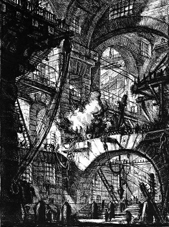
In the theoretical thinking of Piranesi, which was by no means static, the artist recognizes the duality of progressive thinking that arises from the conflict between rationality and feeling as a criterion that he applies to evaluate the works of the past and the present and denote them as ‘vero’ or ‘falso’ (true or false). Giovanni Battista Piranesi is considered one of the most important artists in the field of etchings and vedute. Some of his works, in particular the Carceri (pictures of prisons) and Campo Marzio (a metaphor for the universe that had already been hinted at in the Carceri), are still of great importance today.
Figure 2 – Giovanni Battista Piranesi: Carceri d’invenzione, 1745 Panel VI: The smoking fire / Il fuoco fumante. Piranesi’s etchings of the ‘Carceri’ (prisons) still inspires a multitude of artists and architects. Their impressiveness is probably thanks to Piranesi’s publisher, Bouchard, who had the 16 original panels, which tended to be on the bright side as far as the coloring was concerned, reworked in 1761in order to intensify their dramatic effect through the use of sharper contrasts.
Many of the pioneers of modern film, Sergei Eisenstein, the sculptor Peter Weiss, authors Hans Enzensberger and Erich Fried, and also comic authors like François Schuiten and contemporary architects Lebbeus Woods and Daniel Libeskind used the imaginative world of the Carceri as a basis for their own works. There can be hardly anyone who is interested in architecture who has failed to come across Piranesi. If we put aside all the emotional reactions inspired by his works, the important aspect here is a systematic criticism of the concept of space using the instruments of visual communication. Eisenstein considered in his writings whether it might even be possible to detect chiaroscuro in Piranesi, which is not formally possible due to the limitations of etching techniques. It is, however, possible, if one investigates Piranesi’s works closely with regard to spatial composition, the play on light and shade and the creation of an engrossing atmosphere. His drawings are like a stage setting that delivers an acrobatic performance and draws the observer into a virtuoso experience of space.
On the other hand, the strange combination of opulence and severity in Eisenstein’s designs produced images of incredible effect and bizarre beauty – a reflection of the events in paintings and wall frescos gives a mythic dimension to his film work.
From ‘Golem’ to ‘Metropolis’: atmospheric architecture in film
The world of film has always provided architects with a welcome opportunity to play out their ambitions with fantasy and create illusions. With manifestos and utopian drawings, revolutionary new concepts have been thought out and presented that are free of the economic and structural limitations that are usually imposed by builders and building authorities.
The ‘expressionist’ films, for example, were usually purely studio productions with clever lighting effects and complicated film decor that excluded all elements of coincidence and only permitted things of psychological importance. Daylight and sunshine were done away with, in order to exclude every natural or apparently natural condition. Even when architecture from real locations was used, it had to remain no more than a mere backdrop. When placed under an expressionist composition of light, image and motif, otherwise unspectacular functional buildings and softly romantic ruins appeared to be places of impending doom. They were ‘atmospheric architecture’, exaggerated by the magical ‘sfumato’ lighting. The imagery of the scenography was sometimes so reduced that the dynamics and light modeling of the image composition built throughout on the principle of expansion and contraction of light and dark Valeurs, and one really can speak here of ‘abstract’ architecture. The viewer is lulled into a dream by the scenography and light. The light has precedence, the objects do not have their own form, rather a form is bestowed on them by the light as it models them. Only the light exists, consequently the more an object identifies with the light, the fuller it appears, as a light source or mirror.
Bruno Taut, too, was very taken with the medium of film, and particularly with its quality as a collective work of art. He wanted at least to live out his visionary plans on celluloid as an ‘ersatz’ for their material impossibility in reality. Cinema offered the opportunity to bring together everyday life and fantasy, reality and utopia, even if only for a short time. In the architectural urban symphony ‘Der Weltbaumeister’, he dispensed entirely with plot and character and dealt only with ‘the theme of the change and transience of fantastic architectural forms’. His film scenario consisted of more than thirty charcoal drawings with wide graphite strokes and dramatic lighting effects on a black and white contrasting screen. Although the epic ‘Weltbaumeister’ was never made, Taut’s commitment to film was strong, and his influence had a lasting effect. Coop Himmelb(l)au and composer Jens-Peter Ostendorf staged the play in 1993 as an opera, as part of the ‘Steirischer Herbst’ festival in Graz.
Hans Poelzig’s interest in film was about contemporary with Taut’s, but was more productive. The film architecture for Wegener’s “The Golem: how he came into the world” was true ‘handiwork’ with numerous effective horror effects that drew the crowds more than the esoteric attempts of other filmmakers did. Also, Poelzig’s eruptive medieval nightmare had nothing in common with the rather naive gothic utopia of the grail-seeking romantics surrounding Taut, who paid homage to a crystal mania of illuminated domes, crystal palaces and crystal world buildings. Poelzig’s architectural masses, earthy and expressionistically distorted, were the exact opposite: a kind of anti-utopia. Not only did he attempt to apply the habitus of an expressionist image onto a building, he also portrayed the internal life of the architecture of a gothic dream.
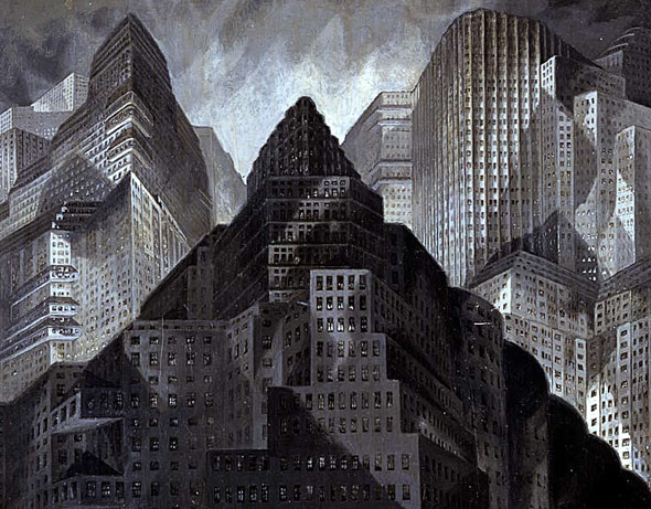
In this connection, Fritz Lang’s ‘Metropolis’ must also be mentioned. This film shows extremely subtly how a ‘supertown’ is overturned, becoming a prison of skyscrapers, and exposes the capitalist skyline as a new tool of oppression by confronting inner conflicts. What is significant here is how the architectural forms are divided into each social language of class, as the ‘top’ of the city of the future is made exclusively for the rich. Beneath it lies the city of the plebs, and right at the bottom is the underground ‘factory city‘, which guarantees the wealth of the ‘upper city’.
Figure 2 – Erich Kettelhut: Draft sketch for film scenery for ‘Metropolis’ Deftly employing dramatic light and shadow effects, this sketch portrays the hypertrophic architecture of ‘Metropolis’, the city in Fritz Lang’s well-known film of the same name. Controlled from a command center in the new tower of Babel, the city can be seen as a pessimistic counterpart to the almost contemporaneous, rational urban visions of Le Corbusier and other architects.
Modern technology appears here as an instrument of domination and suppression. The symbolic language is absolutely hybrid, almost ambivalent. On the one hand it is related to classical public buildings, on the other it refers to the megalomaniac urban planning utopia of the Italian futurist Antonio Sant Elia (Citta nuova, 1914), while the cuboid houses of the sleeping city with their homogenous windows and purified prismatic shapes evoke aspects of a ‘Neue Sachlichkeit’. It would appear that Lang wanted to subject not only the human figures, but also the architectural form to a diabolical dialectic between good and evil.
Showing, suggesting, omitting: the information content of drawings
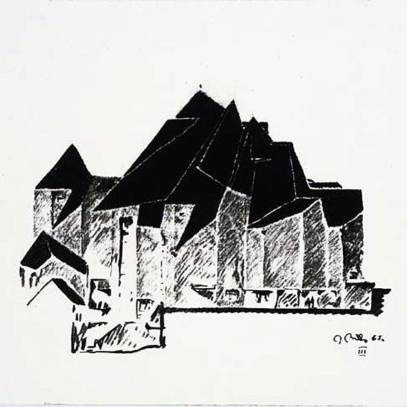
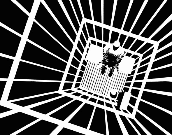
In order to explain better what I mean here, I will use a comparative example, with Gottfried Böhm’s design drawings from the church in Neviges and the comic ‘Silent Night’ from the ‘Sin City’ series by Frank Miller. Both are black and white drawings with extreme contrasts, indeed there are almost no shades of grey at all in Miller. It is only possible to see the contours and these are reduced to a minimum. The information conveyed by the pictures relies on a concentration of information.
Figure 3 – Gottfried Böhm: Pilgrimage church in Neviges, 1965. Almost two-dimensional and greatly simplified but nevertheless clearly recognizable, Gottfried Böhm illustrates the cubature of the church architecture with its expressive fold structure roof. Powerful contrasts of light and shadow are characteristic of the charcoal drawings of the winner of the Pritzker prize in 1986.
Figure 4 – Frank Miller: Sin City, 1991. Like Böhm, Frank Miller also succeeded in implying space, volume and structures with white and black areas. The drawings, some of which are gloomy and foreboding, reflect the content of the comics that portray the criminal underbelly of large cities.
The image inspires the imagination, one can imagine the basic delineations of space and the rest is interpretation. In art or comics, this strategy works without any difficulty. In architecture, on the other hand, it is more difficult, since it is about a personal drawing with an autobiographical character – a character that is difficult to judge because it only reveals the artistic intention. Even the ‘spatial’ poster-like images of Archigram, which were closely related to pop and comic culture, do not provide any more information about simulated space. The 2D-collages, about which the viewer may enthuse spontaneously or arbitrarily (there are no parameters for decision), or indeed not, remain adhered to the paper. These drawings can only be understood as concept diagrams.
However, if we assume that it is also possible to think with the eyes, and if we consider architectural drawings as a medium for communicating and simulating future environments, and for testing an idea before it is realized, this is not enough. Apart from aesthetic ideas (sketches and drawings) and functional ideas (a technical plan, floor plans, cross-sections and views), we have to know what our actions actually result in. Do we not expect too much of a drawing here? To return to the comparison with King Lear, we perhaps have to recognize that we can only love this medium as a draughtsman can love his tools – no more and no less – and that we have already reached the limits of this method of expression.
We must ask ourselves what new instruments are needed in the 21st century to create the world of tomorrow. This is an inherently conceptual question and not a stylistic one. What would a Piranesi do today if he had the latest technological tools at his disposal?
In Sydney Pollack’s documentary about Frank Gehry, Gehry talks about his own house in one scene, and the angled, overhead glazing in the kitchen. The glass continually reflects different things, like the cars driving past, then trees, clouds, a starry sky, depending on the time of day and year, or the weather, or just whether it has been cleaned or not. Gehry finds it particularly exciting during the evening of a clear night when the moon suddenly appears in the ‘wrong’ place. A little later, the reflection of the moon appears in a different place, and so on, until nobody can tell what is ‘right’ or ‘wrong’ any more.
These reflections are a perfect example of displacement: things appear in a broken form in places where they should not really be. If the ‘thing’ is daylight, this game is even more unpredictable. Reflections are entropies that come and suddenly disappear again, unexpectedly, since they themselves are dependent on non-linear systems that are difficult to understand.
Systems like, for example, the weather or the structure of material surfaces and textures. The latter can practically never be regular, due to inaccuracy in their construction or later to wear and tear. Even photography has a hard time here, since the ‘right’ view depends on the right moment, and as soon as the shutter is released, what was previously objective becomes subjective and the authenticity is lost. When you then also consider the possibilities offered by a photographic laboratory or digital image processing, photography is essentially a designed view and designed shade, communicated through picture segments made for us by somebody else.
Light, space and imagination: the drawing as a model
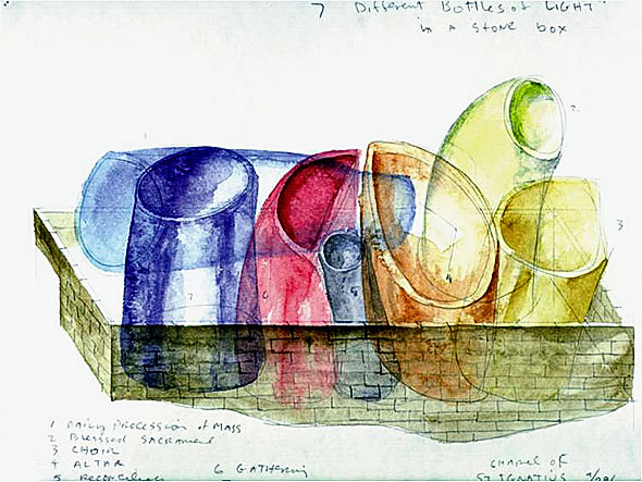
The American architect Steven Holl endeavors to create architecture with light – his project for the Chapel of St. Ignatius in Seattle is acknowledged to be a successful example of how daylight, materials and textures and also reflecting surfaces can be put to use. The guiding concept of the building is ‘seven bottles of light in a stone box’. The metaphor of light is created with different volumes – starting with the roof, which has an irregularity that creates different qualities of light, and finally all coming together in a common ceremony. The only question is whether the watercolor drawing of Holl’s design does justice to the actual complex interplay between space, light, shade and reflection that is achieved, and whether we can rely on experiences (even ones that can be measured or simulated) other than on personal and artistic ones.
Figure 5 – Steven Holl: Sketch of a concept for the St. Ignatius Chapel in Seattle. Seven bottles of light in a stone box – This is how Steven Holl describes his draft concept for his chapel on the university campus in Seattle. In this watercolor, he illustrates its approximate volume, while intimating the functional layout of the building.
In my opinion, we architects will only be responsible for two things in the future: space and light, especially daylight. This is the substance of our entire expertise, and we are unrivaled in this. I am expressing this a little polemically on purpose, since a precise explanation would go beyond the limitations of this text.
New computer technologies and rendering processes will be useful to us in this work. However, the simulation of light is not only the generation of a scientific picture, it also has artistic requirements. Apart from looking at information of a technical nature, this tool can also be used to examine a design proposition and make it clear to an onlooker. It would be wrong to assume that renderings are simply surface painting. Pictures, images and drawings do not simply reproduce reality, they are the result of a simulating process. The image is not a portrait, but a model, illuminated by virtual light sources, whereby parameters are determined using complex procedures.
Pictures are always interpreted and read differently, and we seldom think with the eyes. It is more common to search for a feeling or atmosphere, in other words for a completely subjective manner of observation. This is a challenge for pictures that are supposed to have a scientific character. Scientific pictures are the product of a long and complex production and selection process with many processing stages, decisions and contingencies. In this way, they are eventually able to part from the context of their making and take on their own reality.
The impression that we have come up against an objective condition in the real world does not succeed until the experimentally created phenomena make ‘sense’ – in other words, when we succeed in creating a conformity between the theoretical expectations, the observed events and an understanding of the function of the calculating and evaluation processes used in this work.
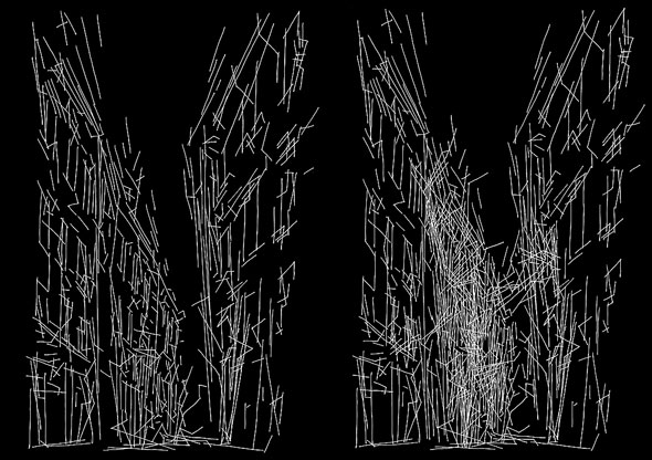
Figure 6 – Lebbeus Woods: System Wien, 2005. In his ‘System Wien’ (Vienna system) project, Lebbeus Woods interprets architecture as the “organization of energy”. With just a few ‘fleeting’ strokes, Woods shows the street space, the facades which frame it and even a suggestion of light and shadow.
The pictures are tools that are used to work with. In order to serve their purpose, they should be seen as working instruments, even when the work only concerns the pragmatic and objective qualities of space. They should not be seen as an ‘extra’ that is used to explain a project or, indeed, make it more attractive. In the process of computer-based image generation, interactivity has proved to be a fundamental means of checking designs better and improving them, not simply for depicting them. The use of pictures here has proven to be a working process in which the computer and the human eye are integrated and which is, due to developments in image technology, moving towards a space of visual virtuality. If William Gibson’s science fiction vision ‘Virtual Light’ comes true, we are heading for a future where optical sensation is created directly in the eye, without photons as bearers of light.
‘Imagining’ (creating ideas) and ‘Imaging’ (creating pictures) will then become one, but the final image will develop further when we learn to understand with the eyes and when we no longer read pictures in order to interpret them, but in order to simulate real or virtual environments and test their qualities. It does not matter here whether these are logically tangible or sensual characteristics. This means that the new drawing not only serves to depict planned, future worlds in an exact, technical and photorealistic way, it can also predict the artistically optional comprehension of spatial perception.



You must be logged in to post a comment.